Delighting Features – Mobile – Account Settings
During grad school, I led a team of four people as Scrum Master, working on a consulting project for the client. We researched site improvements across platforms and we introduced different concepts on delighting features. We looked for opportunity for an interactive and delightful feature to enhance experience of the website or mobile apps. The idea was that customers could visualize their portfolio quickly and granularly.
Provided Information from Client
- User story: As a prospective financial customer, I want to easily find information that will guide me to make decisions.
- Concept: Restructure Client’s home page to incorporate flat design. Maximize space and encourage engagement with a carousel-style navigation at the bottom.
- Value: Make the site (and hence, investing with the Client) look clear, simple, and honest.
- Example: http://moneyfirsts.com/
- Recommendation: Develop a content strategy. Content is the key aspect that will make things useful. The site has a lot of content, but requires the user to click around and discover these things.
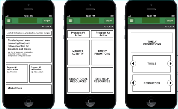
We explored mobile and tablet and found the organization of user account information could be restructured to create quick access, reveal information at a glance, and provide a more meaningful outlook of user information.
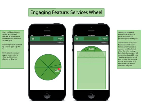
I liked the idea of a “wheel” that could be animated easily when using one hand to hold the phone and spin the wheel.
H
